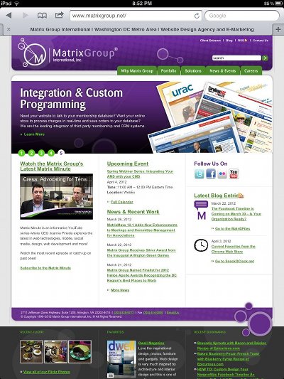
I love my iPads (I have an iPad1, iPad 2 and my 3 is on the way). I think most iPad owners feel the same way. I’ve owned an iPad for nearly two years but it wasn’t until recently that I realized just why websites look so good on this device. The iPad automatically scales pages up and down so that they display at the full resolution of the iPad. Let me explain.
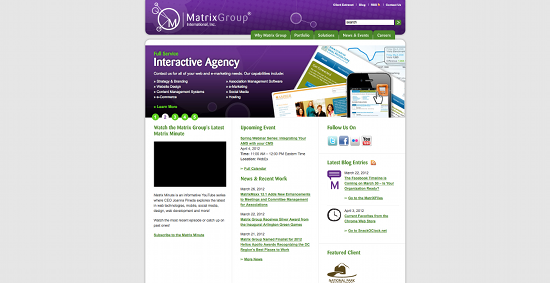
As Web designers, we’re used to thinking in terms of pixels. At Matrix Group, we normally design sites for a 1024 pixel width resolution. This means that on a 1024 resolution monitor, the website fills the screen. On a widescreen or higher resolution monitor, the website is centered and there is space to the right and left of the page. Check out the Matrix Group website on my widescreen monitor.
In fact, most websites look like this on my widescreen monitor at home and laptop at work. But on an iPad, most sites look like this:


What I love about scaling is that I’m making the most of the real estate on the tablet and most sites are fairly readable, without a lot of pinching and zooming. I’m told that there are ways to prevent this automatic scaling on an iPad but I don’t really see why a web designer would do so.
Next week, after I get a chance to play with my iPad 3, I’ll blog about how the new version supports high resolution images and how we web designers can start creating images that fit the type and resolution of the device. Very cool stuff!


One reply on “The iPad Scales Websites So They All Display at the Same Resolution and Look Great”
Short sighted article. This is more of a problem than a help. Apple trying to take laws into their own hands again is all.
Also, no point comparing your landscape widescreen desktop monitor to a portrait view on an ipad.