
Guest post by Alex Pineda, Matrix Group Creative Director
New year, new possibilities, especially in web design. With technology advancing at an unprecedented rate, design possibilities seem limitless in the coming year. What do I think we’ll see, design-wise? Here are my predictions for the top 5 web design trends in 2020:
Progressive Web Applications (PWAs)
The major advantages of PWAs are (per Wikipedia):
- Progressive — Works for every user, regardless of browser choice, using progressive enhancement principles.
- Responsive — Fits any form factor: desktop, mobile, tablet, or forms yet to emerge.
- Faster after initial loading – After the initial loading has finished, the same content and page elements do not have to be re-downloaded each time.
- Ordinary websites often already made use of the browser cache to avoid re-downloading the same data redundantly. But on progressive web applications, the same elements do not need to be re-rendered again.
- Connectivity independent — Service workers allow offline uses, or on low quality networks.
- App-like — Feels like an app to the user with app-style interactions and navigation.
- Fresh — Always up-to-date due to the service worker update process.
The term “Progressive Web app” was first coined in 2015, and by 2019, there are an increasing number of companies that use PWAs as the means to distribute their services and content, including Twitter, Pinterest, Trivago, Tinder, etc. As the barriers to entry decrease for creating PWAs, we can only expect more companies to release their own.
Design for Accessibility
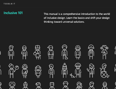
“Inclusive Design is a methodology, born out of digital environments, that enables and draws on the full range of human diversity. Most importantly, this means including and learning from people with a range of perspectives.”
To design accessible experiences, keep these things in mind:
- Think carefully about your audience – consider who is being included, and who is being excluded.
- Ensure your interface provides a comparable experience for all so people can accomplish tasks in a way that suits their needs without undermining the quality of the content.
- There are basic principles to follow that enable the best user experiences for the greatest number of people.
Light vs. Dark Mode
Developers are now working with toolkits and standards, on both Safari and Chrome, that enable your browser to detect which mode (light vs. dark) you are using on your OS, and switch the color scheme on the website to react accordingly. It will be the responsibility of the website creators to decide if they want to enable this on their site, and how best to adopt a style that works for both. There are a number of guides and tips out there on how design for dark mode, that can help designers and developers take advantage of this new ability, and let users decide for themselves what they prefer.
Oversized Type & Big Elements
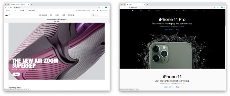
Websites, particularly for top brands, are favoring large prominent elements – from oversized typography to full screen images, usually a combination of both. Huge elements like this make a bold brand statement, catch the user’s attention, and help them understand what the site is all about.
In order to make this approach work, a minimalist approach is necessary. Reducing the content to a single image (or video) + a short title makes for a clearer message, and an uncluttered experience. Less is more, but make a big statement!
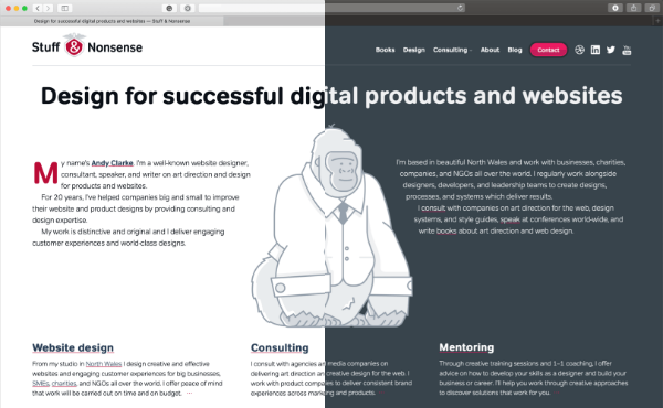
Illustration as the Brand Personality
Rather than relying on stock imagery or a generic photo, brands are using tailored illustrations to convey their brand personalities. My favorite example of the use of these illustrations comes in the form of the 404 Not Found pages such as:
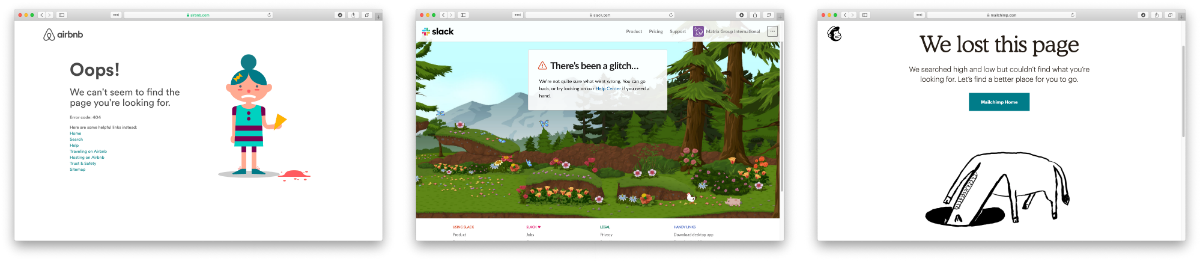
The key to using illustration successfully relies on their uniqueness and consistency. If you have the budget, hire an artist whose work you think matches well with your brand vision – dribbble and other artist portfolio sites are a good way to find them. If you don’t have the time or budget to commission an artist, there are a plethora of vector art libraries on sites like istock or gettyimages, just find collection that has a good number of illustrations to serve your needs.
Which design trends are you most excited about in 2020?

