A couple of weeks ago, we unveiled a new home page for the Matrix Group website. We didn’t change the overall navigation and we didn’t create a new look and feel for the site. All we did was revamp the branding area and re-arrange elements on the home page. Small changes, big impact.
Most organizations go years between redesigns. It’s a big deal to redesign a website; it takes a boatload of time, effort and money. But in between redesigns, most organizations become unhappy with their sites. We have clients come to us because they’re unhappy with everything on their site, which was last redesigned 3, 4, or 5 years ago. Does it have to be this way? I think not.
There are many, many reasons to redesign your website, including:
- Your organization’s mission, name, logo and/or brand have changed dramatically.
- Visitors complain about not being able to find what they’re looking for.
- Your products and services have changed or you’ve added new offerings and you don’t know where to put all the information.
- You are rethinking how your website fits into your company’s overall marketing strategy and want to redo all or nearly all of the content.
BUT, if you’re largely happy with the design and navigation of your site, visitors are able to find what they’re looking for, and your company branding and messaging remain the same, perhaps all you need is a website refresh. Here are some ways in which clients have refreshed their sites:
- One client changed the headers graphics throughout the site and added social media widgets.
- Another client made the entire website wider (the site had been designed for 800 x 600 pixels) and added another column on the home page for events and a featured publication.
- Yet another client revamped important landing pages and improved pages by editing the text and adding images and formatting.
If you don’t have the budget for a full redesign this year, opt for a refresh and focus on content and making calls to action more prominent.
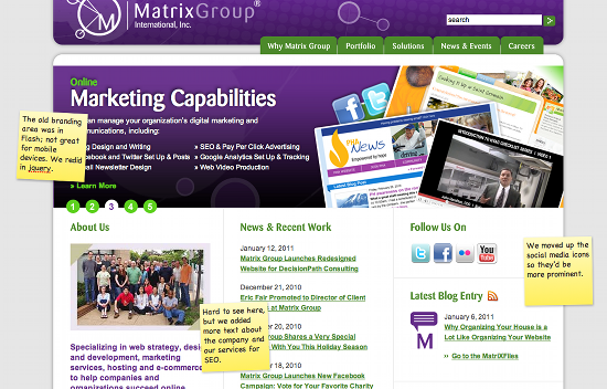
BTW, here’s a photo of the new Matrix group home page and reasons for the refresh. I’d love to know what you think.
How about you? What’s in store for your site in 2011? Full site redesign or refresh?


4 replies on “You Don’t Need a Full Redesign to Improve Your Website”
Joanna – Thanks for confirming the gradual evolution of our web site content. We chose this path since we are very satisfied with the look and feel of our site and its navigation but need to keep the content fresh.
BTW, love what you’ve done with the Flight 93 Memorial web site! Anyone who hasn’t visited the site should do so–the spontaneous expressions of gratitude for these heroes is very uplifting. I wholeheartedly support the memorial construction and encourage others to consider the same.
I’m delighted that you guys redid the branding area using jQuery rather than Flash.
I think making iterative improvements rather than simply large-scale redesigns makes tons of sense. For one thing, effective design of all the components that make up a web page — even simply a home page! — is such a huge task that it’s almost impossible to devote adequate time and attention to each element, let alone devote the kind of careful thought, testing, and even experimentation that helps produce the best possible choices.
Breaking down the task into smaller, faster improvements can result in really nailing a few of the most important details, rather than getting some good gestures in the general direction of a great site.
I would add, though, that this is easiest to do if you’ve invested in a really great design in the first place that doesn’t get dated or ugly too quickly.
Btw, you might enjoy Cameron Moll’s seminal article on this subject:
http://www.alistapart.com/articles/redesignrealign
Joanna – great article! You definitely hit the nail on the head with the modifying tweaking ones website vs. a full redesign. The new branding area is not only better for mobile devices but it also looks great!! Great post, thanks!