My answer to this question is: NOW. Here’s what I usually hear from prospects and clients.
Objection #1: “My mobile traffic is tiny.” This might be true today but mobile usage is growing really fast. More importantly, every single one of our client sites that went responsive is now seeing huge increases in mobile usage, with mobile now representing double digits. This tells us that visitors keep coming back when you reward them with a great mobile experience.
Objection #2: “Responsive is expensive to implement.” It’s true that responsive can add up to 20% more to the overall design and implementation budget. Whenever we can, we use wireframes and designs to explore ways in which websites should look and behave differently on different devices, based on the tasks we believe users need to accomplish on said devices. These discussions, the development work and the testing are often labor-intensive. The good news is that most CMS platforms (we like Sitefinity and WordPress) make it much easier to implement responsive design. In fact, if budget is limited, we can implement default responsive templates. So please don’t let budget stop you from going responsive with your website.
Objection #3: I’ll wait until our next redesign.” While it’s tempting and certainly easier to embark on responsive when you’re in the thick of a redesign, unless your redesign is happening right now, I don’t think you should wait. Can you really ignore the needs of the 25% mobile-only audience and the 22% market share of mobile devices for overall traffic?
Objection #4: Search isn’t that important to my online strategy. Even if you think your target audiences won’t look for your products and services via search, you can’t ignore this statistic from Search Engine Journal: 93% of all Internet traffic starts with search. Further, Google is demoting sites that aren’t mobile-friendly because 25% of search clicks are from mobile devices, and climbing.
If you’re still not convinced, just look at your own mobile device usage and think about how wonderful it is when your favorite news or retailer site has a great mobile site and you can do what you need on a phone or tablet.
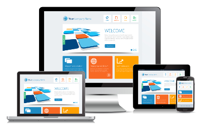
It’s time to go mobile. It’s time to go responsive.


One reply on “When Is It Time to Implement Responsive Design?”
The alternative mobile strategy, of course, is a dedicated app. What does this mean? It means creating a separate application strictly for a mobile platform, that can borrow from, but is separate from, your main website. For those of us with smartphones, we’re very familiar with dedicated apps (yay Spotify!), and at Matrix, we’ve created several apps for our clients, both on tablet and phone. It makes sense to create a mobile app when you have an audience that is primarily on a mobile platform, and the app will make good use of a mobile devices capabilities, such as GPS, the camera, accelerometer, etc. Designing & creating a mobile app is quite different from a responsive site, but in many cases, is an even better service to provide for your mobile users.