When we moved to our new office in Crysta City, it meant reprinting all of our marketing materials. While it was simply a matter of updating and reprinting most of our collateral, we decided to redesign our business cards. Matrix Group Creative Director Alex Pineda wanted to update the design with the refreshed logo and show some more personality.
Here are some sample cards that demonstrate what we were trying to achieve.
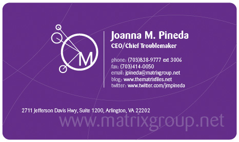
Here’s my card. The front is purple so it’s easy to find on a cluttered desk or stack o cards. The corners are curved because Alex says the Matrix Group brand is curvey, node-y. The prominent elements are my name and title and the company Web address. You’ll also notice that my card has all the ways you can contact me: phone, fax, e-mail, blog and Twitter.
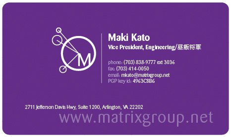
Here’s Maki’s card. The general format of the card is mostly the same, but Maki’s card has his PGP key ID, which is a public key encryption that allows anyone to send an encrypted e-mail to Maki; only Maki has the decryption key. You’ll also notice that Maki has two titles: one in English and one in Japanese. Everyone at Matrix can have a serious title, a fun title or both. Maki’s fun title is Shogun of Lunch in Japanese. Other fun titles at the company are: Digital Cowboy, Idea Launcher, Master Juggler/Cat Herder, .NET Rock Star, Go To Guru, Server Sensei and Marketing Maven.
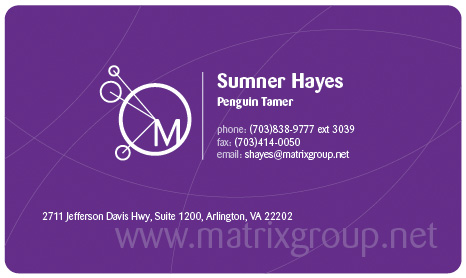
Here’s Sumner’s card. Sumner’s card is most like everyone else’s card. He’s got contact information (phone, fax, e-mail) and simply a fun title. Because Sumner is a longtime Linux contributor and he programs in Python on a Linux system, he’s a Penguin Tamer. Tux the penguin is the Linux mascot, fyi.
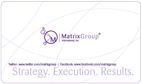
Here’s the back of our business card. The full Matrix Group logo is displayed prominently, along with our tagline: Strategy. Execution. Results. You’ll also notice that we list the URLs for our Twitter and Facebook pages. Finally, while the front of the business card is smooth, the back of the card is uncoated and white, so that it’s easy to write a message. I’m famous for writing notes on the backs of business cards that I give away. I write things like “met at ZZZ conference, call about Web design RFP” or “call for lunch.”
I have to admit that the process of redesigning our cards was a bit tortuous, especially since every person had the option of adding a fun title and several of us have a different front. However, we think the new cards are pretty snazzy and consider them to be bold, mini-brochures for the company.
How about you? What does your business card say about you or your company? Do you think we were successful with our card redesign?


5 replies on “The Art and Science of Business Cards”
I LOVE the new cards and like the way you explained them. I’m also impressed by Maki’s alternate title (I think it should be somewhere in English, too!). I also appreciate the concept for the back of the card because too many cards with glossy fronts also have glossy backs and I like making the notes as you do.
Congratulations on a beautiful new design!
Thanks Eileen! We’re happy with how the cards turned out as well. Its always interesting designing internal materials, because you have to stop and think about your own branding message, instead trying to visualize someone else’s. Given that a business card is often the first experience someone has of your brand, it’s important that it represent all the elements of your brand. For Matrix, those elements include the curves, color, typeface, logo, etc., all which try to speak to someone about what Matrix is like as a company.
We actually spent a great deal of time thinking about those brand elements, and how we wanted them to evolve, as part of an overall marketing message. We wanted to emphasize the playful nature of our company, give it a warm feel, and as JP points out, make it stand out from the stack of business cards anyone has on their desk.
Also as JP mentioned, we wanted everyone to have the opportunity to customize their card, as it is in a sense an extension of themselves. Hence the the fun titles, variations in elements, and so on.
“the back of the card is uncoated and white, so that it’s easy to write a message”
Yes, yes, yes a million times! When my fiancee resigned from her previous job and created personalized cards on Zazzle.com, that was the one “must-have” tip I gave her. I must have learned it from you!
Also, I love how Maki’s card shows that he’s (1) bi-lingual and (2) a real geek, not a faker.
Despite the looong journey, it looks like it was worth the wait. The cards turned out great, (props to Alex). They really are like mini-brochures, which I think is a good point that people often don’t consider. Wielding a brochure in hand at meetings, conferences, dinners, lunch etc. is too clunky and comes across as too pushy, so a business card really must include all of the information needed to contact you (including SN if it’s relevant!), enhance the ease of communicating (ability to write on the back)…and most importantly, reflect the company culture.
Cheers! They look great, but certainly glad that this particular journey is “fini” for now!
Fun post with a good message. I was recently promoted along with some other staff members. I was surprised when our new business cards went through four drafts before everyone was satisfied with them. I never put much thought into business cards before, but now I understand what an impact they can make.
I wish my organization could show more creativity, but that’s not our purpose. I’m glad you were able to have fun with your cards; they look great! I love the purple. It’s important to stand out–the same concept applies to the frequent-shopper cards I accrue. They all look the same, and I hold up the line everywhere I go looking for the right one. I doubt anyone has trouble finding one of your business cards.