
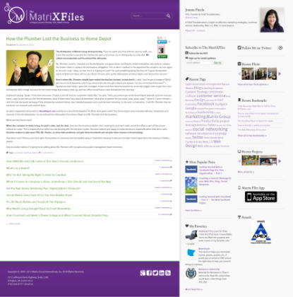
Last week, Matrix Group launched a redesigned version of this blog, TheMatrixFiles.net. Why redesign my blog? I wanted to update the layout and colors, I wanted each post to be more social, and, most importantly, I wanted the site to be responsive.
Responsive web design is “an approach to web design in which a site is crafted to provide an optimal viewing experience—easy reading and navigation with a minimum of resizing, panning, and scrolling—across a wide range of devices” including widescreen monitors, standard monitors, tablet computers and smartphones.
Although my team has developed many responsive sites for clients, it’s always interesting and fascinating to implement a new design philosophy for your own firm. Here’s what I learned:
The widescreen size is the most fun to design for because of all the available real estate. When viewing this blog on a widescreen, high resolution monitor, you get two columns of content in the right rail. At this screen size, the site displays my tags, my recent bookmarks on Delicious, the most popular posts on this blog, etc. I love how the site fills the screen and uses the available real estate.
Designing for a standard monitor is a lot like designing for a tablet in landscape mode. We collapsed the right rail to a single column and the widgets are set to NOT display content. If you click on the +, the navigation slides down to display the content.

Designing for a smartphone is the most challenging. You don’t have a lot of real estate, visitors use their fingers to navigate so you need large buttons and touch areas, and the text has to be readable without pinching. We had several lively discussions about what information to display on the smartphone display. We realized by analyzing our Google Analytics reports that people who visit the blog on a smartphone really just want to read the latest blog post. So we wanted to make it super easy to simply read the latest blog post and be done.

You have to test, test, test your responsive pages. Be prepared to spend countless hours testing and tweaking. For example, you might find subtle differences between brands and models of phones.
Monitor your usage reports. Currently, about 10% of the traffic on my blog comes from mobile devices. If history serves as a guide, this number will grow quite a bit in the next year for two reasons: mobile traffic is increasing in general but, more importantly, when visitors are rewarded with a mobile-optimized website, they tend to come back on a mobile device. I’ll be sure to report on this in the next few months.
I’d love to know what you think of the redesigned TheMatrixFiles website. Which device do YOU prefer to use when visiting blogs? Do you feel that we succeeded in creating a mobile-friendly experience with this blog?


One reply on “How TheMatrixFiles Blog Became Responsive”
I love the treatment of the right rail on wide screen! re: how people are reading blogs? Personally, i tend to browse on my iPhone – my commute on the train is one of my favorite times to read…